2022Stonington Fresh
Brand Identity | swagThe goal:To build excitement around fresh, sustainably caught, boat-to-table seafood from Connecticut’s oldest commercial fishing fleet.
Stonington is a small town located in the southeastern corner of Connecticut, known for its coastal beauty and historic charm. Lesser known is that Stonington is also home to the last commercial fishing fleet in the state, with generations of fishermen working its docks since 1750. Spearheaded by the town’s Economic Development Commission, Stonington Fresh is a branding initiative to help instill local pride in its rich fishing history, as well as turn Stonington’s Town Dock into a tourist destination where travelers can purchase super high quality, fresh-off-the-boat seafood. The initiative required a bold, eye-catching brand that would not only serve as a badge of honor for any establishment offering seafood that meets the high standards of the Stonington Fresh designation, but would also inspire a love and appreciation for the fishing industry and the town itself.


Defining an authentic visual directionThere were several stakeholders to consider going into the project— the Stonington Economic Development Commission, the Southern New England Fisherman and Lobstermen’s Association (SNEFLA), local restaurants and grocers whose cooperation and enthusiasm was vital to the initiative’s success, and local retailers who would be interested in selling Stonington Fresh branded products. We had to develop a brand that Stonington’s fishermen would be honored by, that restaurant owners would be proud to put on their doors, and that visitors would want to bring home with them.
With this variety of audiences and stakeholders in mind, we developed the Stonington Fresh personality to be lively, reliable, welcoming, straightforward, and, of course, fresh. The brand draws color, typography, and iconography inspiration from its subject matter — the New England fishing industry and the town of Stonington.


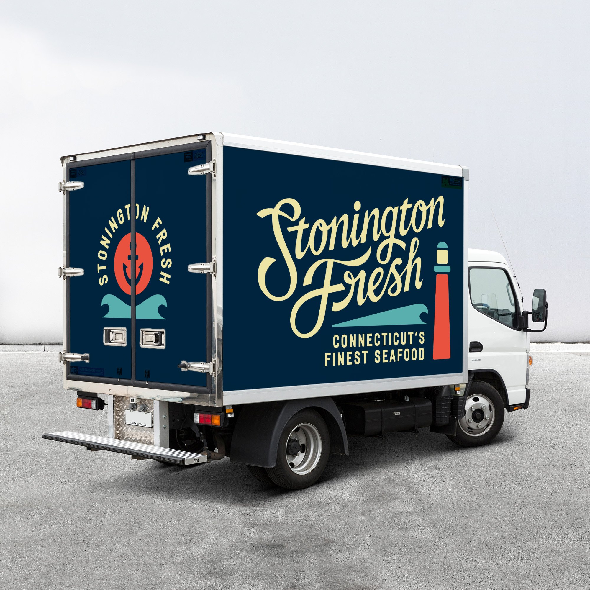

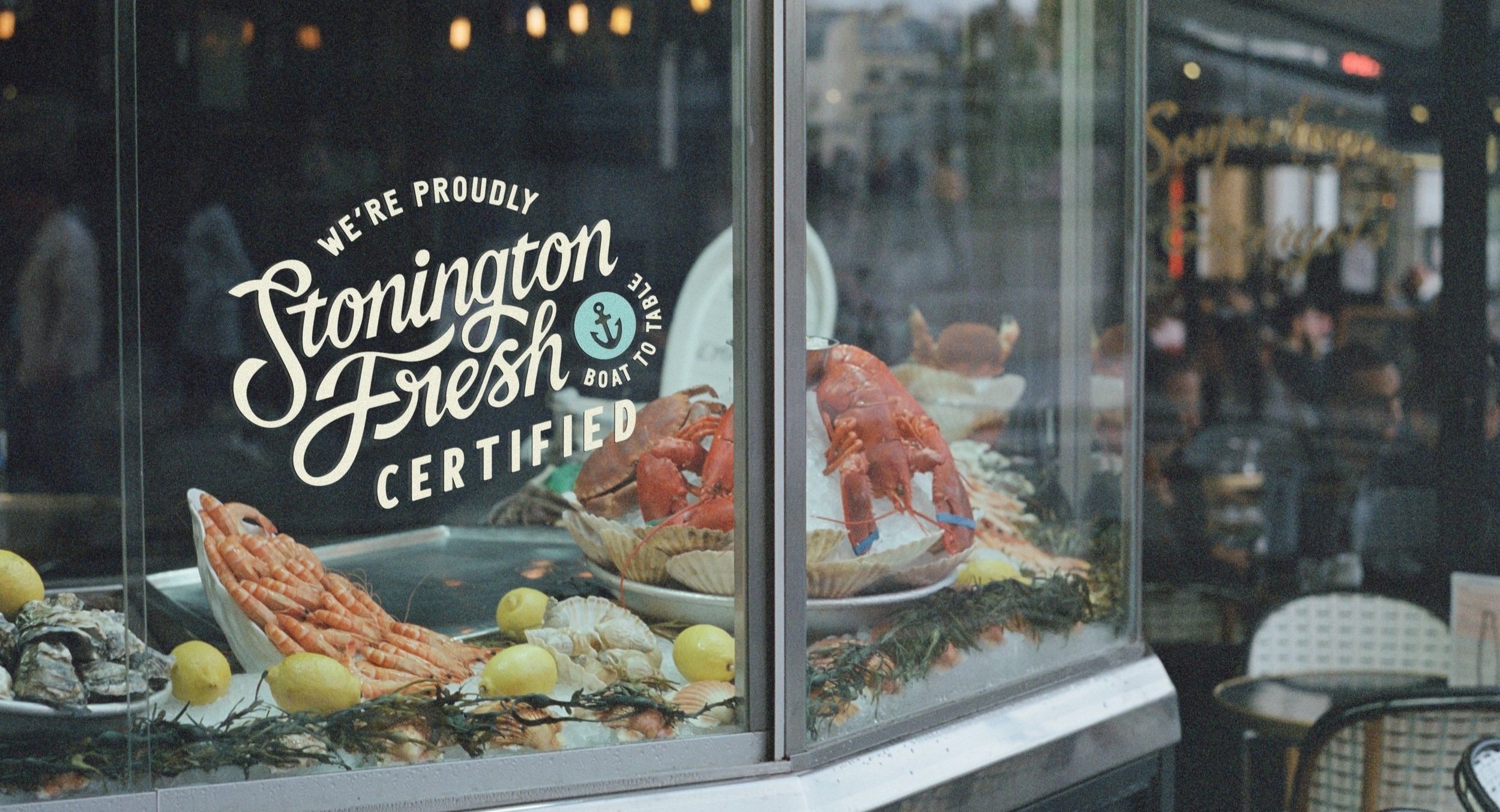
Building an identity for versatility, recognizability, and growthThe identity was built around a wordmark as unique as the town of Stonington itself, hand-drawn from scratch using vintage type references so that it would feel timeless, yet fresh. With lettering that follows a dynamic flow inspired rolling waves, the mark is set on an upward trajectory to impart a welcoming optimism.
We landed on a bright but limited color palette and utilitarian sans-serif supporting typography that evokes hand-painted boat lettering, allowing the system to evolve and adapt to a variety of applications. Lockups were developed with ocean-inspired iconography to help drive home the nature of the brand (without alienating specific sectors of the industry), but also deliberately designed so that the brand can expand beyond seafood in the future by simply trading out the icon and/or taglines.


Championing all local everythingIn order to build excitement and recall around the initiative, we designed t-shirts and hats that residents and tourists alike could sport to show their love for Stonington’s fishermen and seafood, with all proceeds going back into the town and fishing community. As a brand built on championing local industry, it was only natural that Stonington Fresh swag be produced by Stonington-based print shop Emulsion Printhouse. Furthermore, early distribution was restricted to only local retailers— the only place to get Stonington Fresh apparel, just like its seafood, is straight from the source.