2021SPY+ Happy Lens
Campaign design | animation | Brand VisualsThe goal:To communicate the value of a sophisticated technology to a fun-loving audience through a fresh, eye-catching lens.
SPY+ has been a leader in the eyewear, lifestyle, and action sports spaces since 1994, beloved by a massive base of loyal customers for their bold and irreverent brand language and high-quality products. To accompany the re-introduction of their patented Happy Lens™ technology, the company required a visual system and explainer video that would help communicate the Happy story to their audience at a variety of print and digital touchpoints.
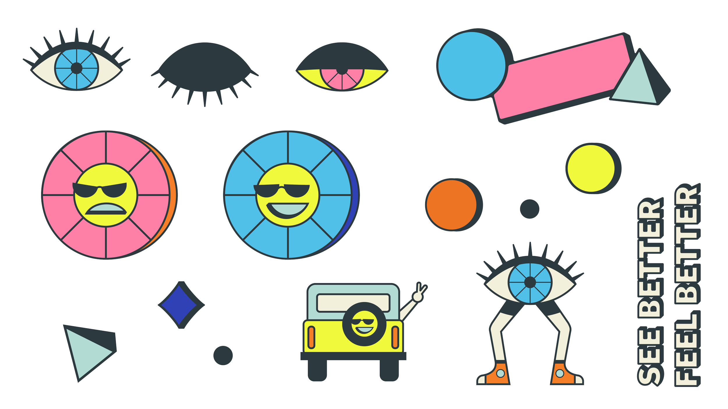
To amplify the simplified, self-care driven messaging, we developed an instructional yet playful illustration style to align with SPY+’s irreverent, bold image, fitting into the brand’s larger visual ecosystem while still maintaining a distinct aesthetic that would be unique to Happy Lens™. With a script provided by SPY+ to guide the structure of the story, we used that visual language to develop a minute-long animation that explains How Happy Works, with bright color and simple geometry as the foundation for a versatile, abstract-meets-surrealist world designed for the viewer to escape to.
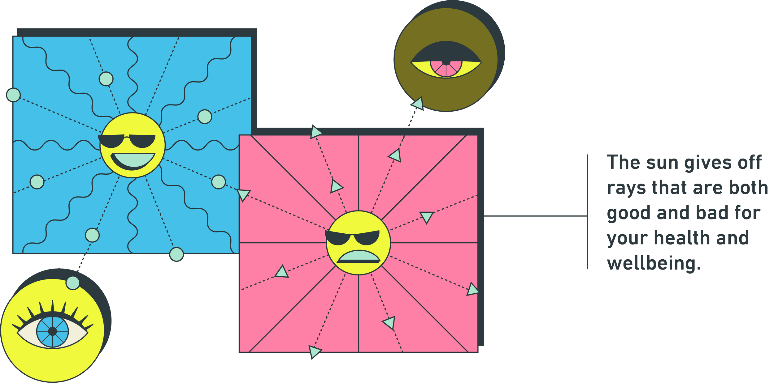


SPY+’s signature Happy Blue is used as the primary color to communicate key positive messaging, with the rest of the palette designed to compliment SPY+’s signature orange-forward palette and provide a combination of calming (mint, olive, pink, cream) and energizing (royal blue, bright yellow) tones. Simple 2D shapes work together through motion and pattern to communicate the Happy Lens™ promise to boost mood, alertness, color, and contrast. These shapes morph into places the viewer might rather be — a desert road, a beach at sunset, a mountain view — grounding the wellness empowerment narrative in a relatable, simple way.
Creative direction by Tony Larson | Happy logo by Brad Simonds