
2022Carrie Cooper DPT
Brand Strategy | Brand Identity | Website | SocialThe goal:To empower rock climbers, clinicians, and coaches to make informed decisions about their health and their sport through beautiful, accessible climbing injury education.
Carrie Cooper is a Doctor of Physical Therapy who specializes in the treatment of rock-climbing related injuries. With nearly a decade of experience treating climbers and as a former professional climber herself, she has developed a wealth of knowledge in this niche field. Given the dearth of legitimate, science-based online resources available for injured climbers, Carrie recognized an opportunity to share her hard-earned knowledge in a way that could expand her impact beyond one-on-one patient visits. In her quest to make reliable, easily digestible educational resources available to the broader climbing community, Carrie came to Finletter Creative to help her build a brand around her expertise that would earn the trust and appreciation of her audience.

Understanding the audience + industry LandscapeCarrie had already identified three distinct target audiences— climbers, clinicians who treat or are interested in treating climbing injuries, and coaches/trainers helping other climbers reach their peak performance. To better determine how to best communicate with each of these groups, we spent hours interviewing individuals to better understand their challenges, fears, needs, and priorities, using our key findings to develop audience personas to represent each group. These personas were used as a guide throughout the branding process to help guide brand language, messaging, website structure, social media development, and more.
The other piece of the strategic puzzle was figuring out how Carrie could best stand out in the industry. As a former pro climber and one of the few women in this niche field, her brand needed to communicate her unique position among her peers. Researching the competitive landscape revealed a lack of female-forward, clean, contemporary brand language and well-organized, easy-to-digest content— a gap that Carrie was perfectly positioned to fill.


Developing A COHESIVE VISUAL LANGUAGEWith an understanding of our audience mindset and positioning opportunities established, we began the process of defining the look and feel of Carrie’s brand. Above all, the brand had to be an effective vehicle for communicating detailed information and often complex concepts, which translated to legible, utilitarian typography and a comprehensive color palette that could be used to provide clarity and hierarchy to scientific drawings and charts. However, we also wanted the brand to feel human and approachable, portraying Carrie’s playful personality and compassionate approach to care.


We developed Carrie’s name and title into a wordmark typeset in a bold, retro-inspired serif with subtly rounded edges and snug kerning to feel friendly and welcoming. The full version of the mark is accompanied by “windows” into a minimalist landscape that speaks to an outdoors-minded audience. A timeless, no-nonsense sans-serif balances the playful personality of the wordmark and echoes the clean monolines of the landscape and technical linework used throughout the rest of the identity.
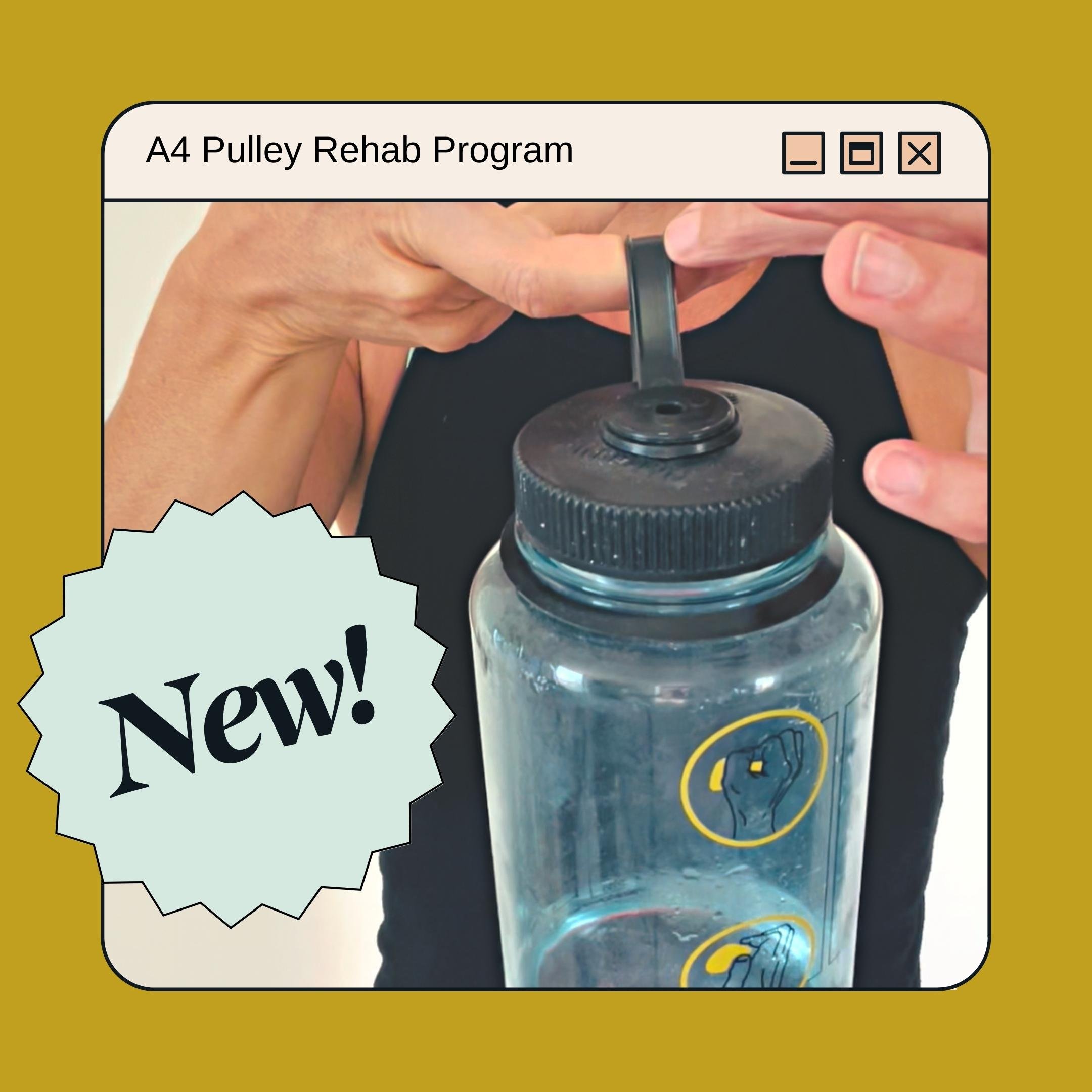
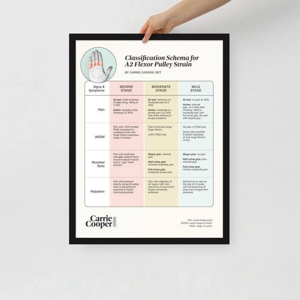
To flesh out the system and provide an additional passive income stream for Carrie, we built out typographical and illustrative supporting elements to put on apparel, accessories, and gear that would appeal to the target audience, including a custom Nalgene designed with dual functionality to be used as a tool in Carrie’s pulley rehab programs. We also translated her peer-reviewed pulley strain classification schema from a spreadsheet into a clear, color-coded chart for reference by other clinicians.
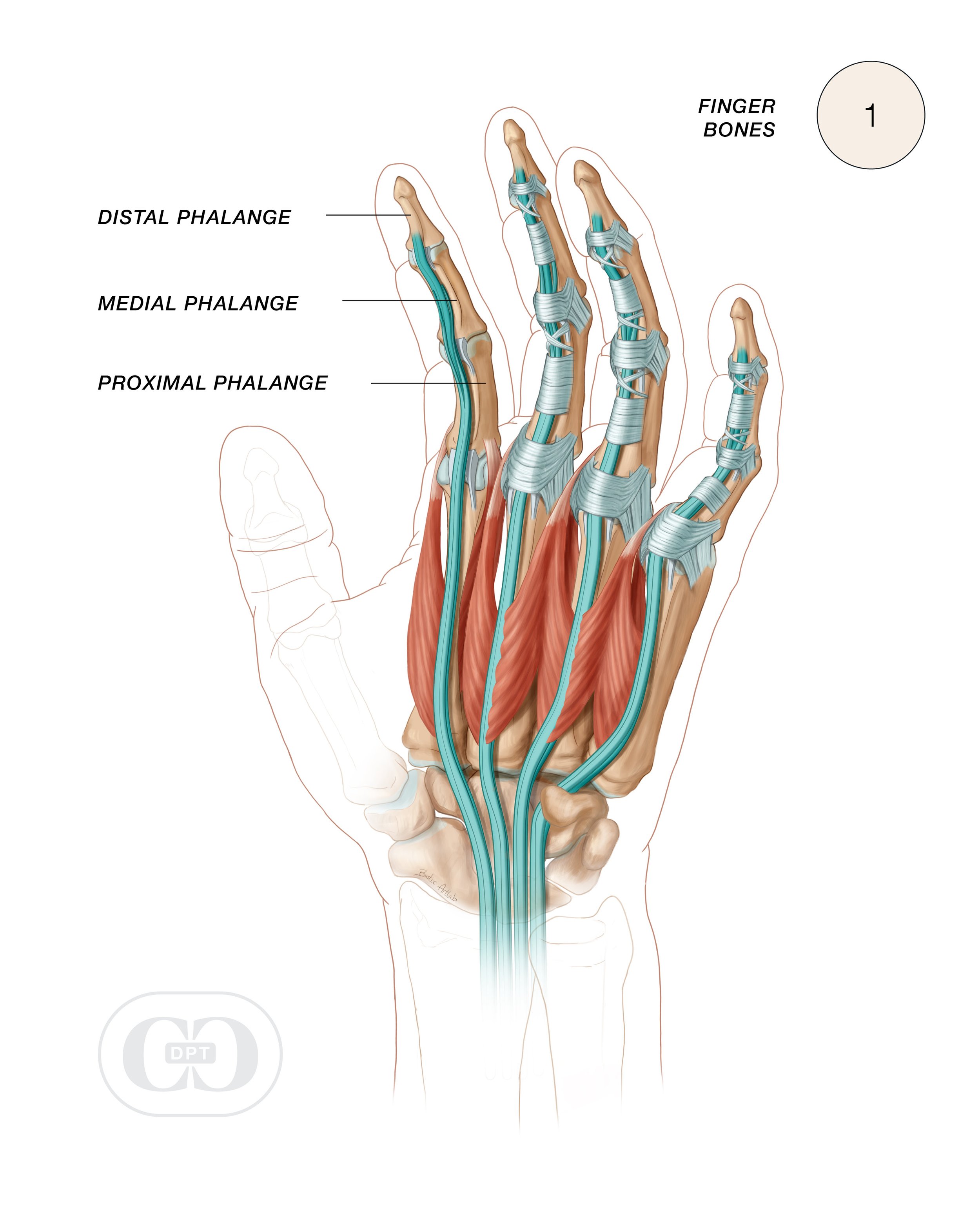
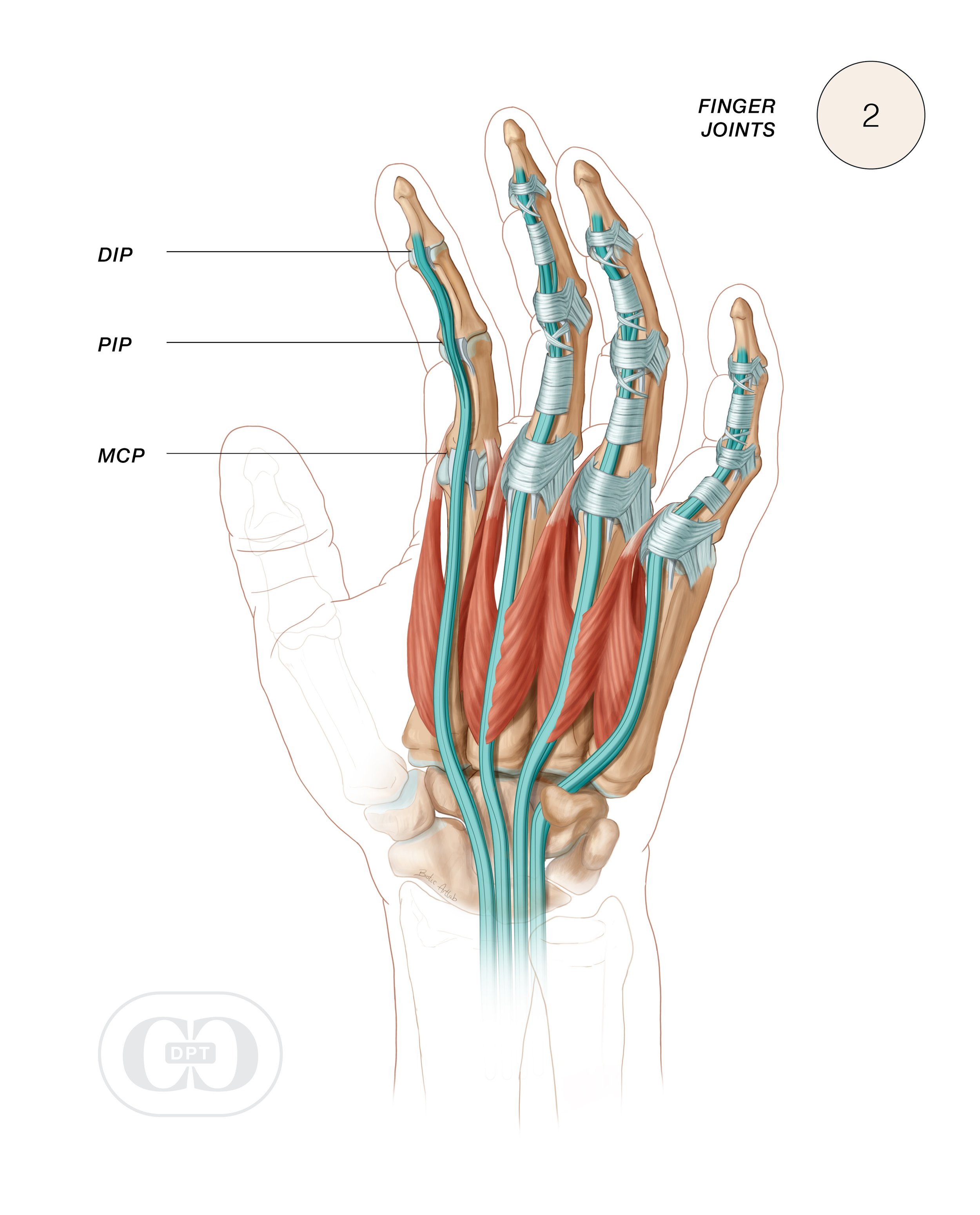
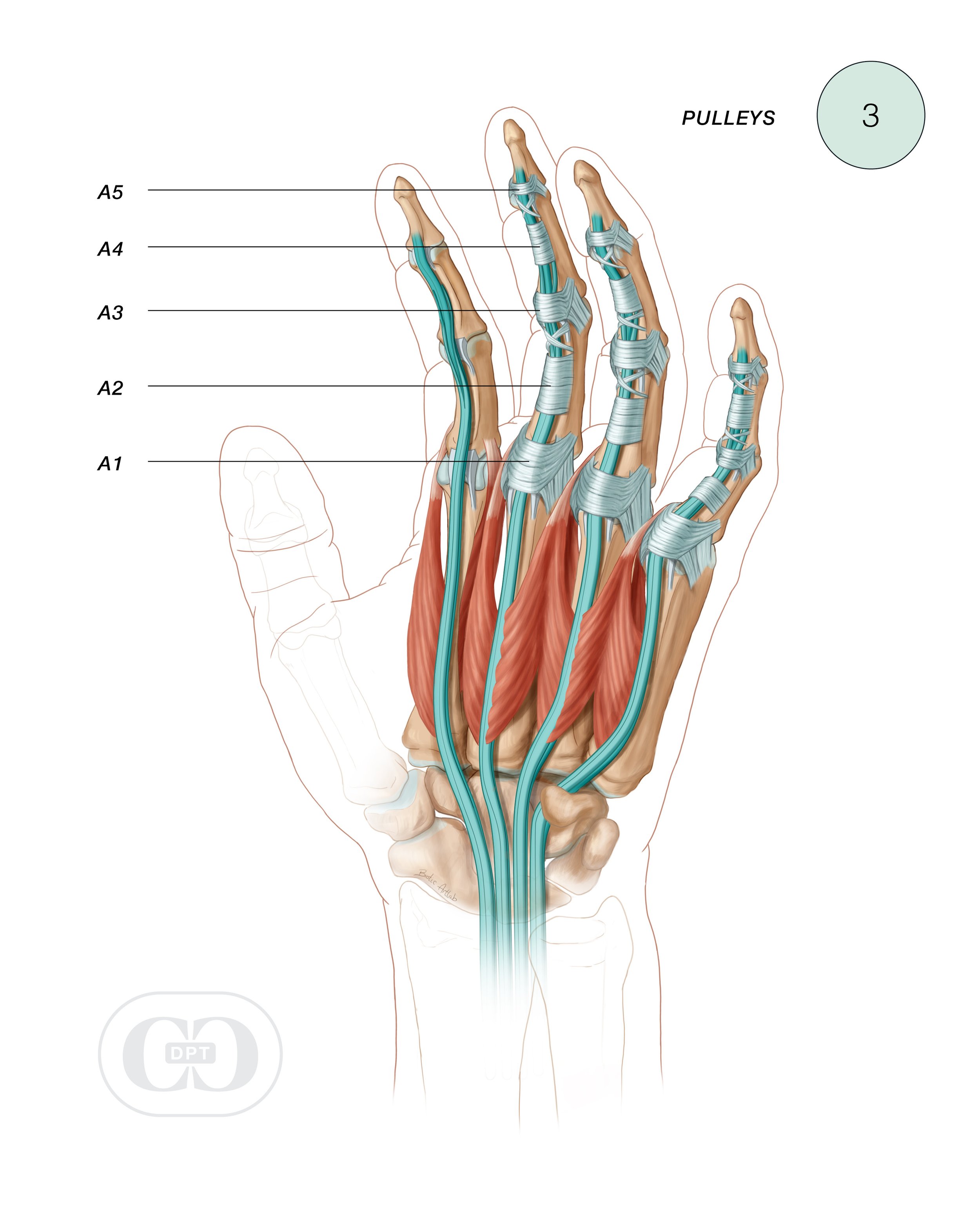
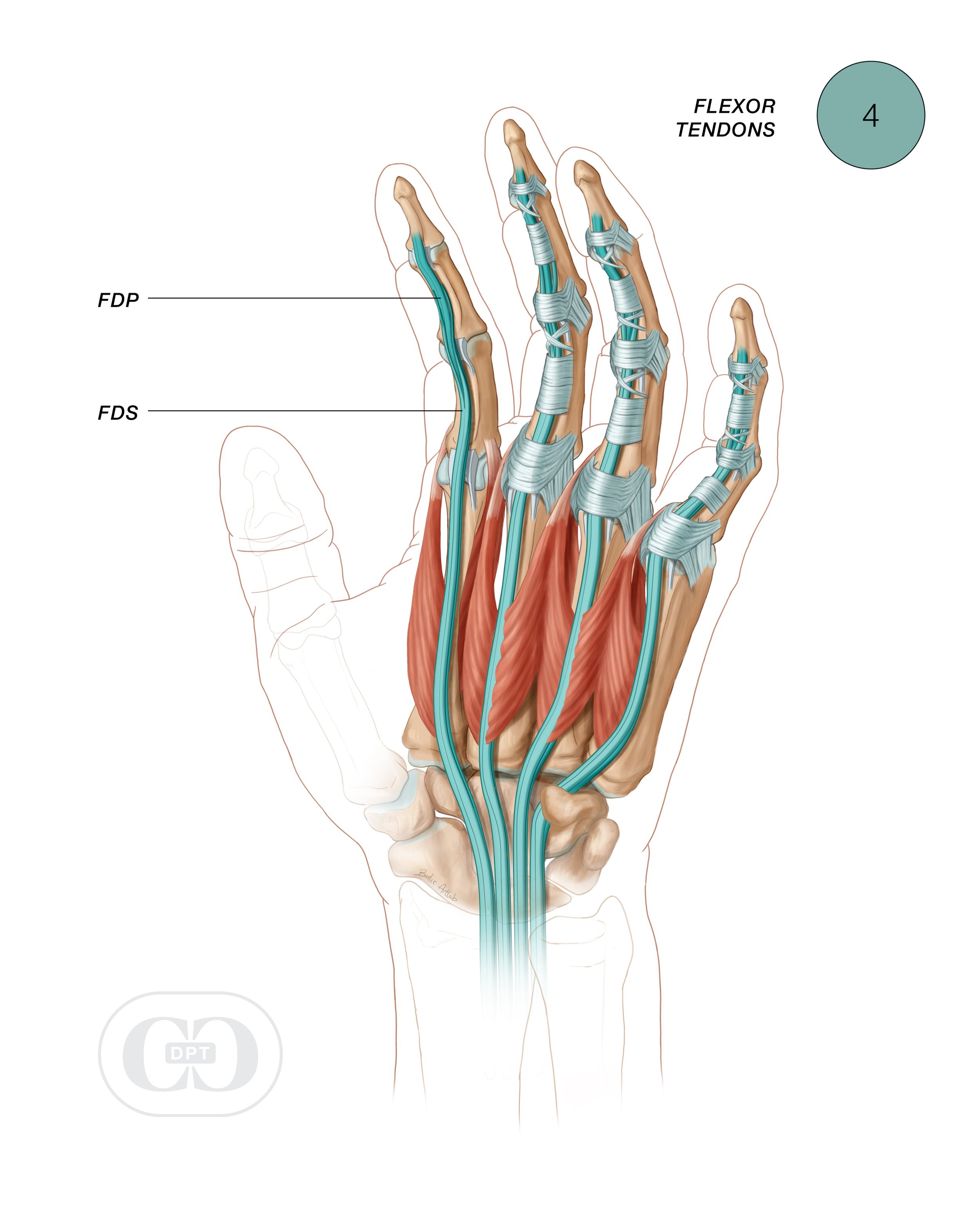
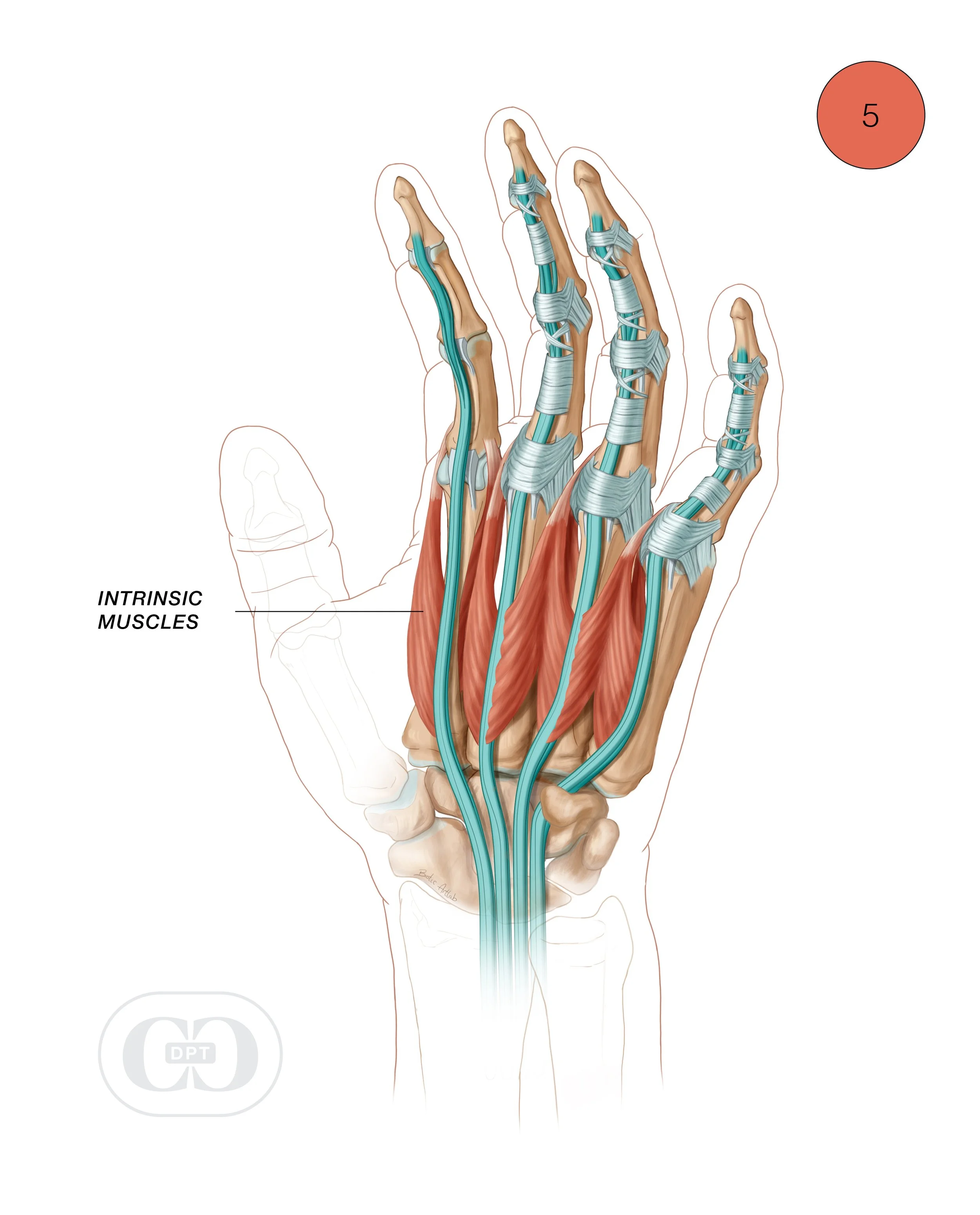
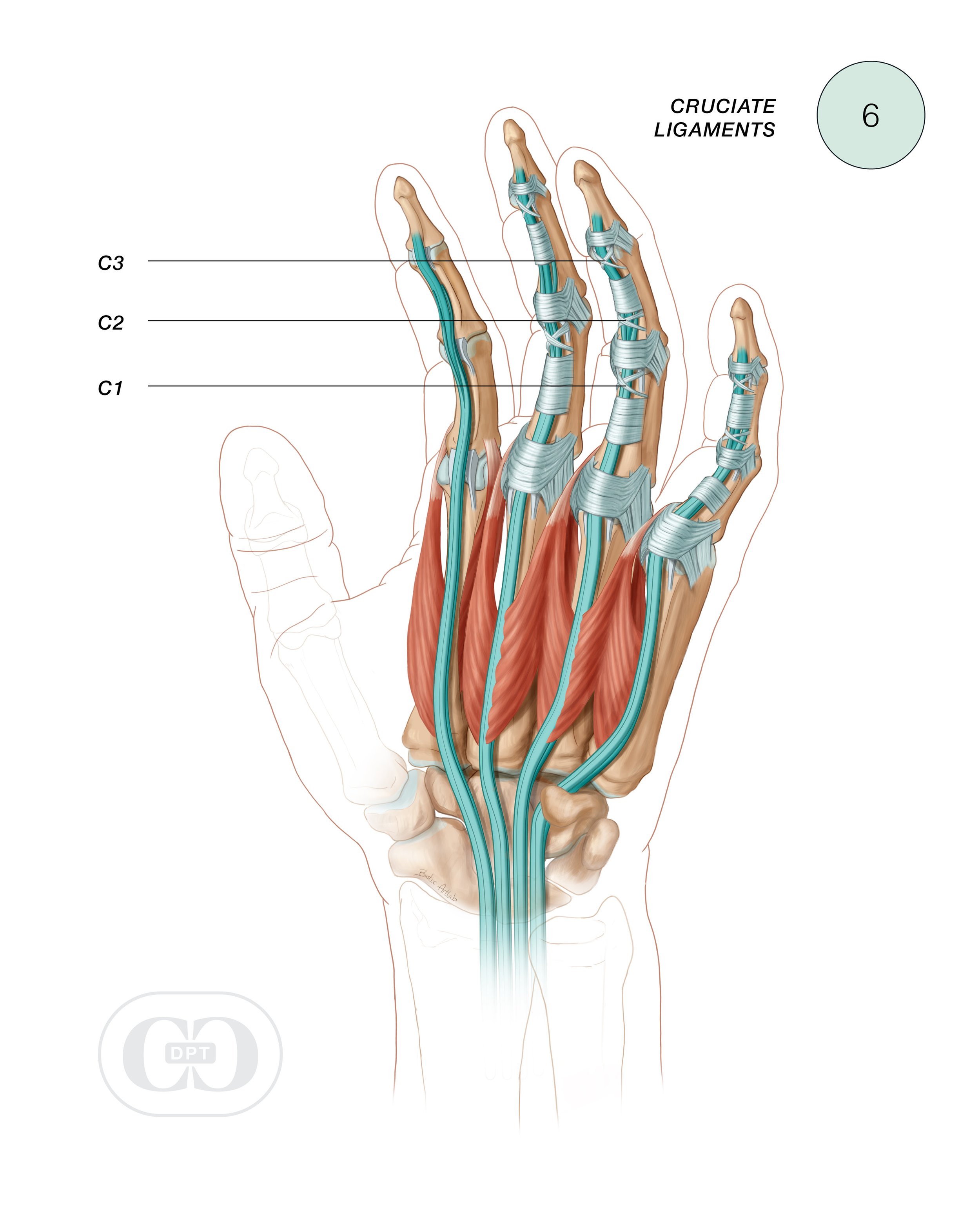
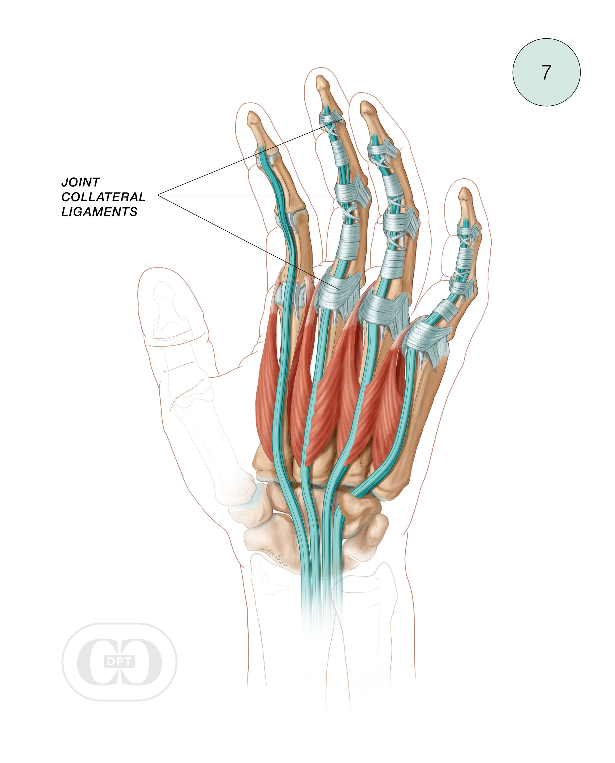
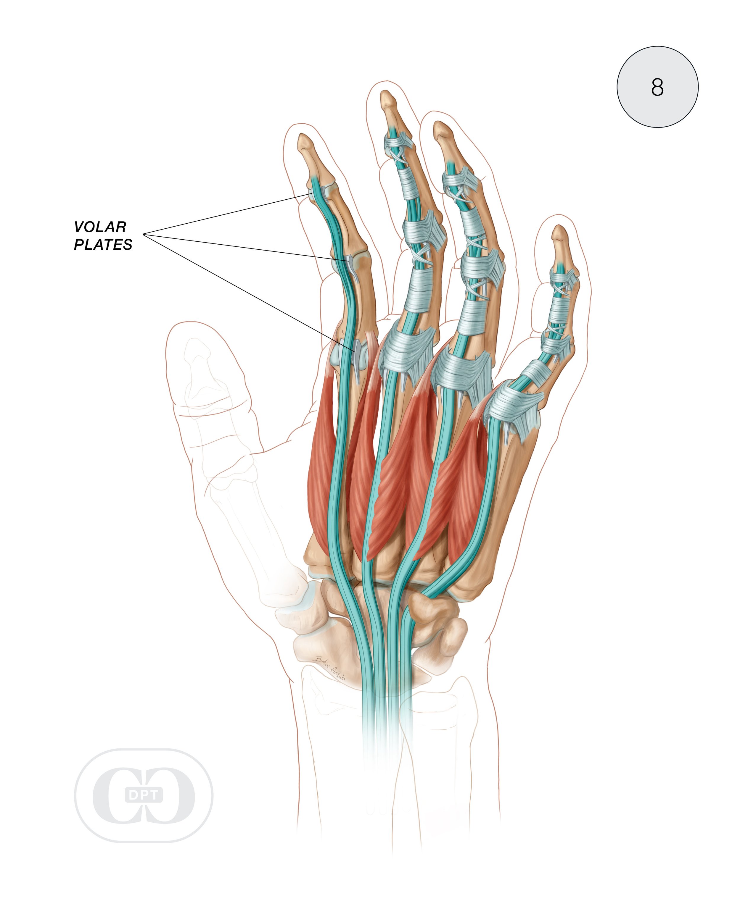
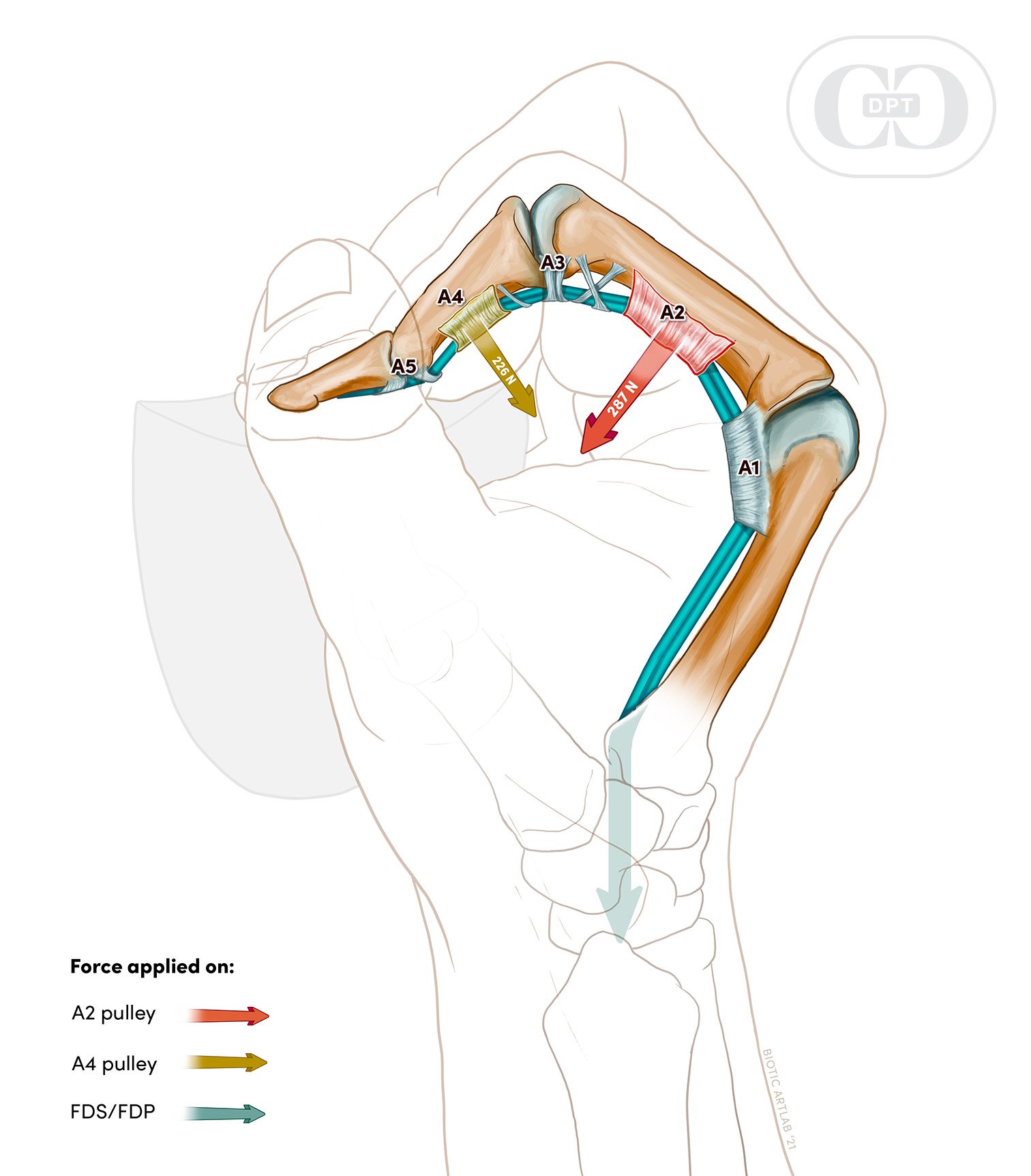
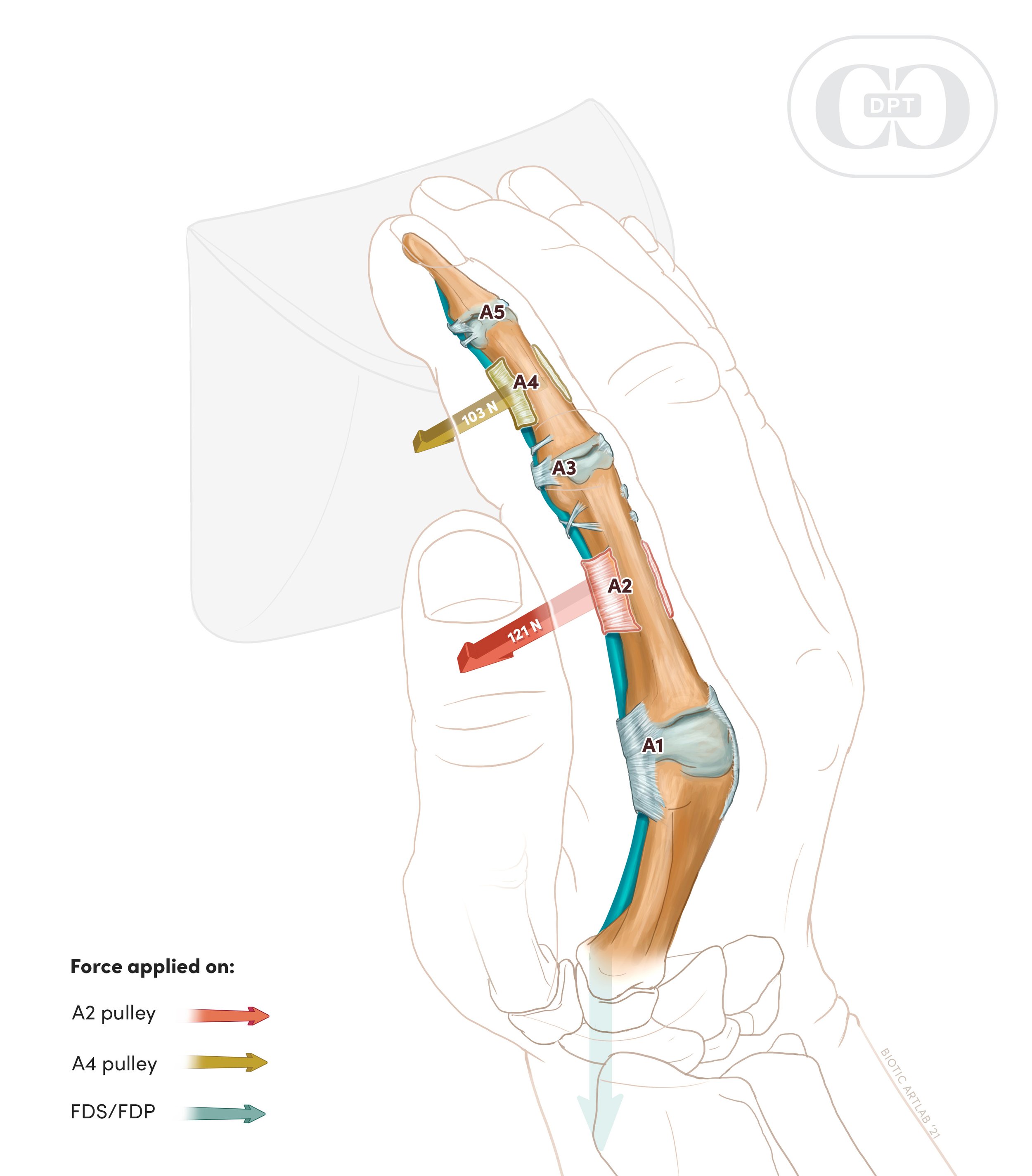
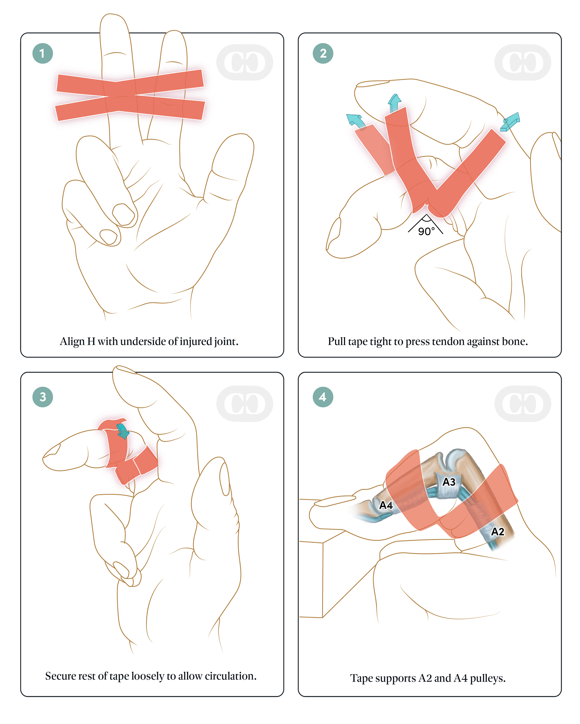
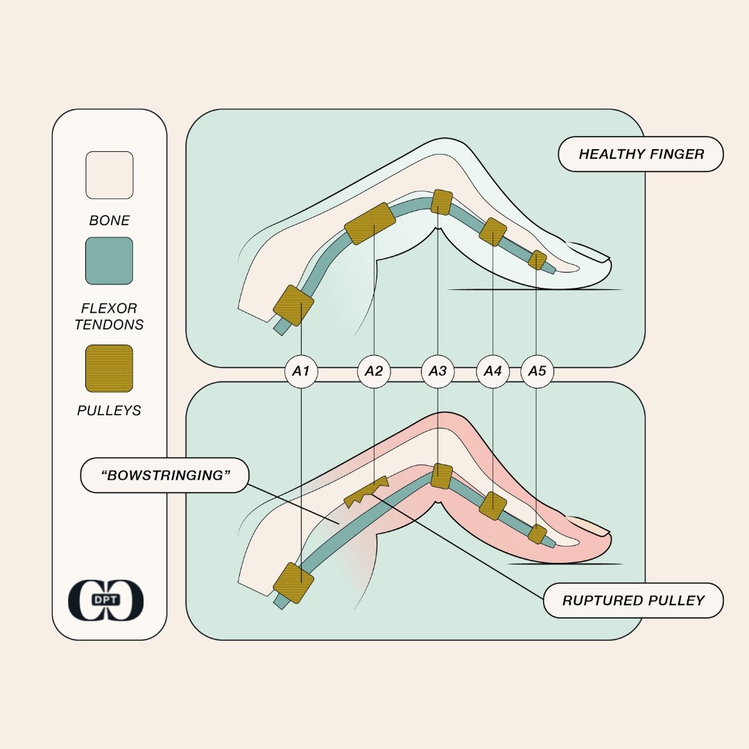
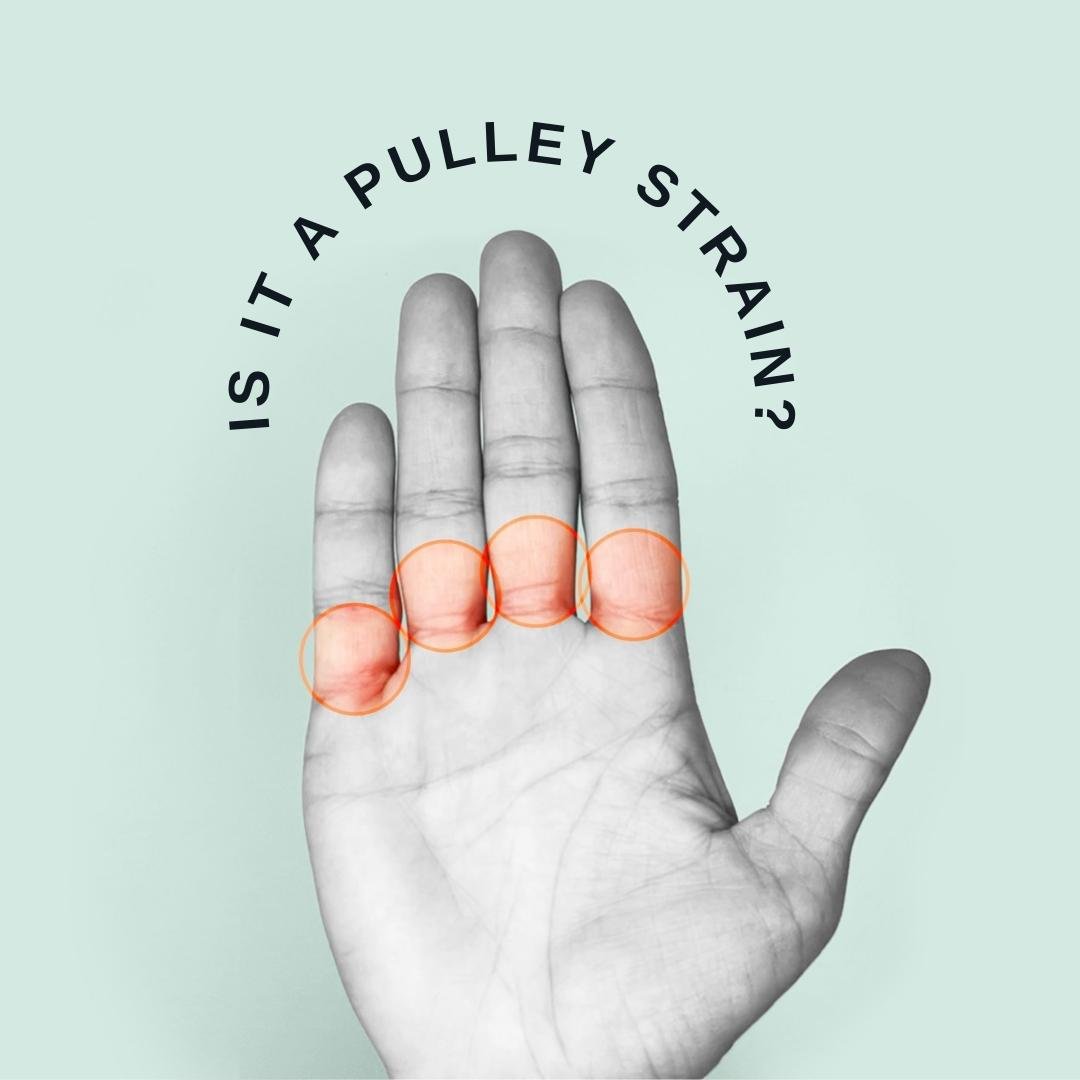
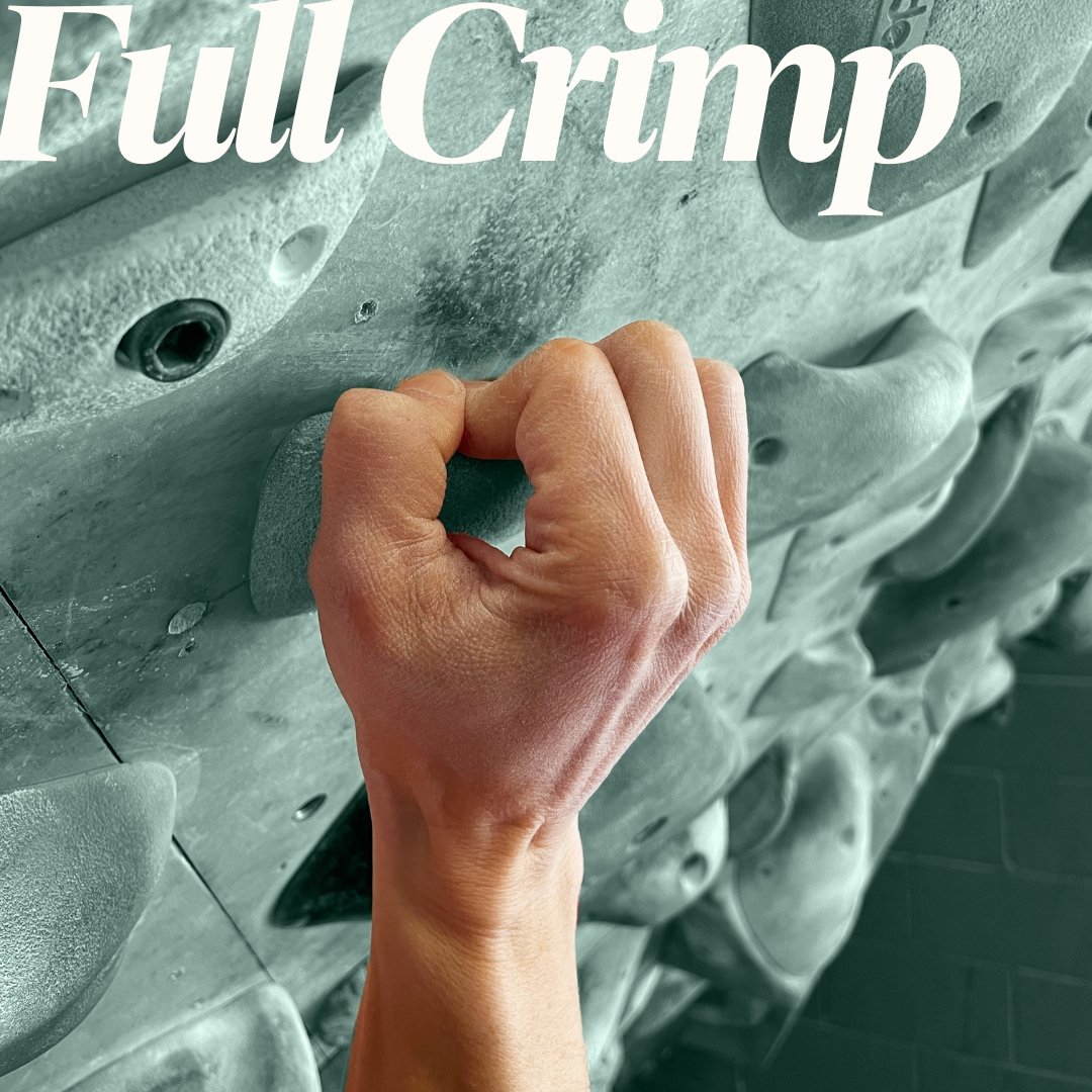
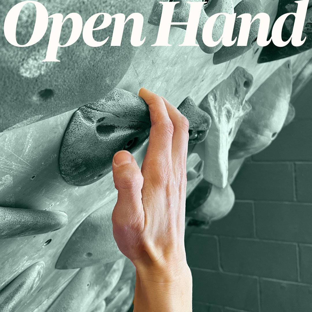
Collaborating with experts on illustrationA key finding from our market research was the general lack of clear, comprehensive, and good-looking visual aids to help climbers better understand finger injuries (the most common injury in the sport), so we partnered with the folks at Biotic Artlab to create custom, on-brand medical illustrations to accompany Carrie’s educational content. These drawings were used throughout the website and online rehab programs to educate the audience on the anatomy of the hand, the forces at work within the fingers when climbing, and self-treatment methods for finger injuries.

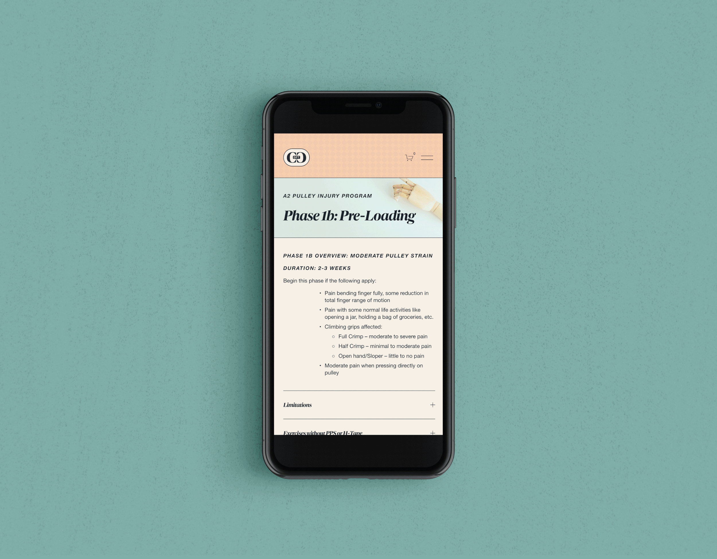


Getting the information out thereThe project culminated in an extensive website build where climbers, clinicians and coaches could go for comprehensive, actionable information about climbing injuries. Along with 101 courses and self-treatment tips for climbers, we built out two unique features on the site that were completely new to the field of climbing medicine. The first was a custom self-assessment quiz for climbers with finger injuries, turning Carrie’s A2 pulley injury classification schema into an easy-to-follow, step-by-step tool that would help them diagnose their injury and understand what steps to take toward recovery. The second was a set of paid interactive rehab programs for climbers with A2 and A4 pulley injuries, complete with phased guidelines, clearly-organized video instructions, and supplemental materials that would guide the user through recovery at their own pace. Though the site currently is only focused on finger injuries, it is intended to serve as an ever-expanding resource as Carrie continues to develop more rehab programs for a variety of climbing-related injuries she treats on a daily basis, in addition to offering certification programs for clinicians interested in working with climbers.
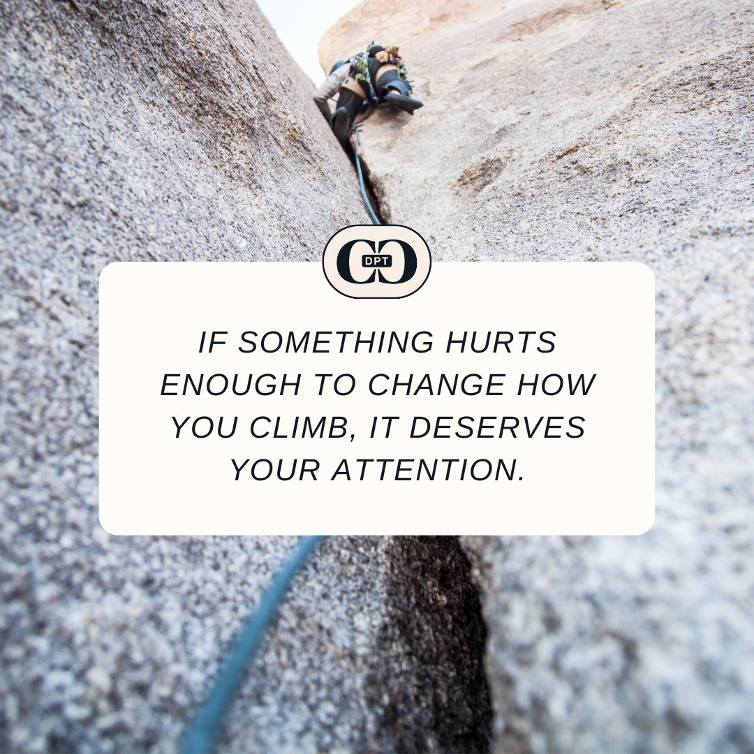
With a large social media following, it was also important we inject Carrie’s new brand into her instagram presence. Through a social media planning grid and a collection of Canva templates, together we created a system for Carrie to post a variety of content relevant to her audience.