
2023Many Futures Foundation
Brand Identity | NamingThe goal:To help a start-up foundation establish credibility while trailblazing a new path in climate-conscious education funding.
Meagan Scaringe set out to build a foundation that empowers education leaders to guide children toward becoming curious, empathetic, bold, and climate-conscious adults. Recognizing that learning happens everywhere — in schools and outside of them, in community gardens and on public lands, and on mountaintops and dirt lots across America— her goal was to fund educational programs and organizations often overlooked by more traditional grant-givers. Meagan and her team came to Finletter Creative to help develop a name and visual identity that could grow with the foundation and reflect their bold vision of a better world for today’s young people.

Developing a name to reflect the visionWith the help of Trimble Advisors, Meagan had established how her foundation would operate — forgoing the traditional, unbalanced grantor-grantee dynamic in favor of forging supportive partnerships with a diverse spectrum of grant recipients. Driven by an abundance mindset and inspired by Adrienne Maree Brown’s idea that there is no one perfect path forward, we landed on the name Many Futures Foundation as a representation of the organization’s unconventional funding approach and optimistic, dynamic vision for the future of education.

Defining a distinct visual languageWith the name of the foundation established, we set out to define a visual direction for the brand that would reflect its key personality traits — empathetic, bold, curious, respectful, optimistic, and playful— and convey the organization’s unique approach without sacrificing professionalism and credibility. Additionally, because of Meagan’s connection to Rivian, we had to consider how the visual language might exist in the context of, or alongside, the Rivian brand.
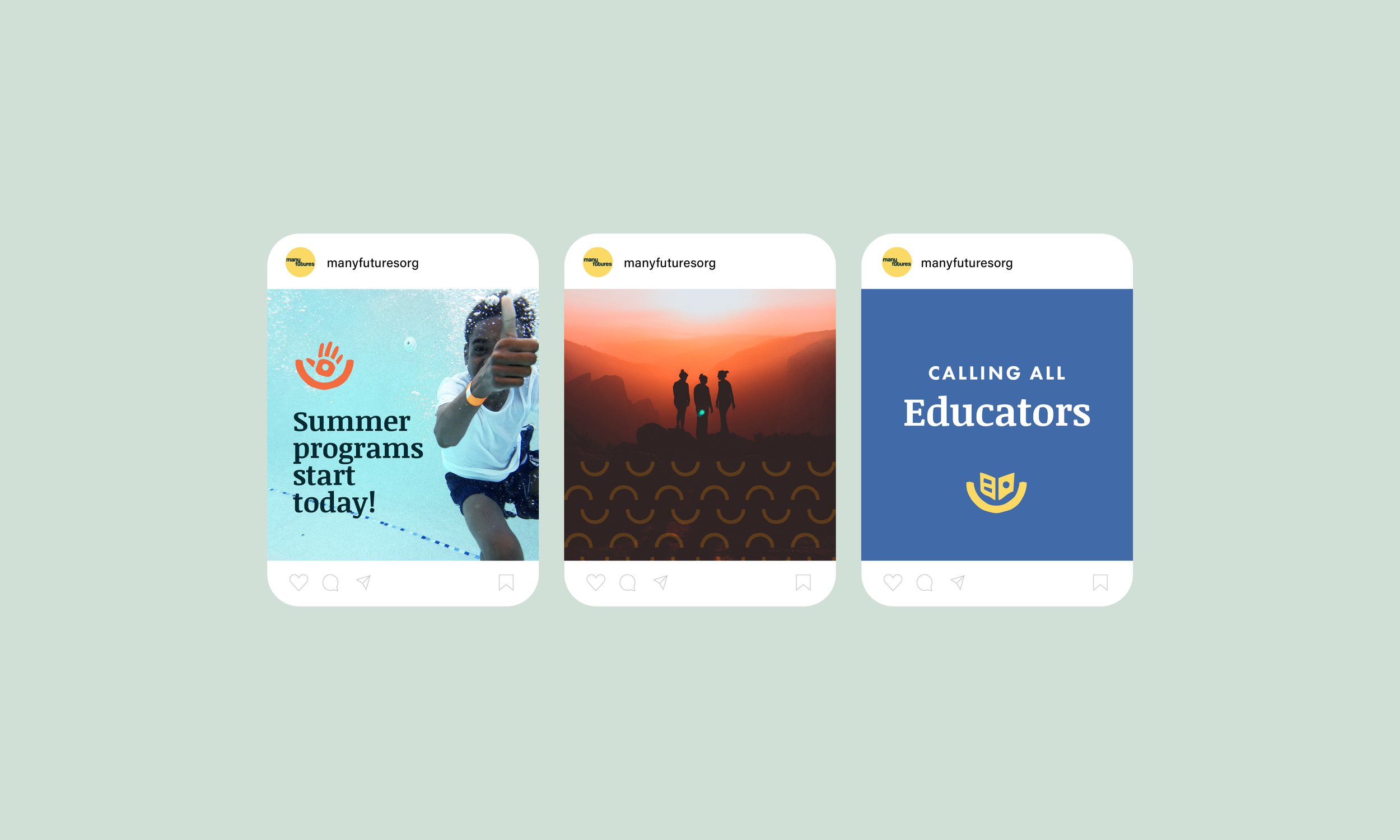
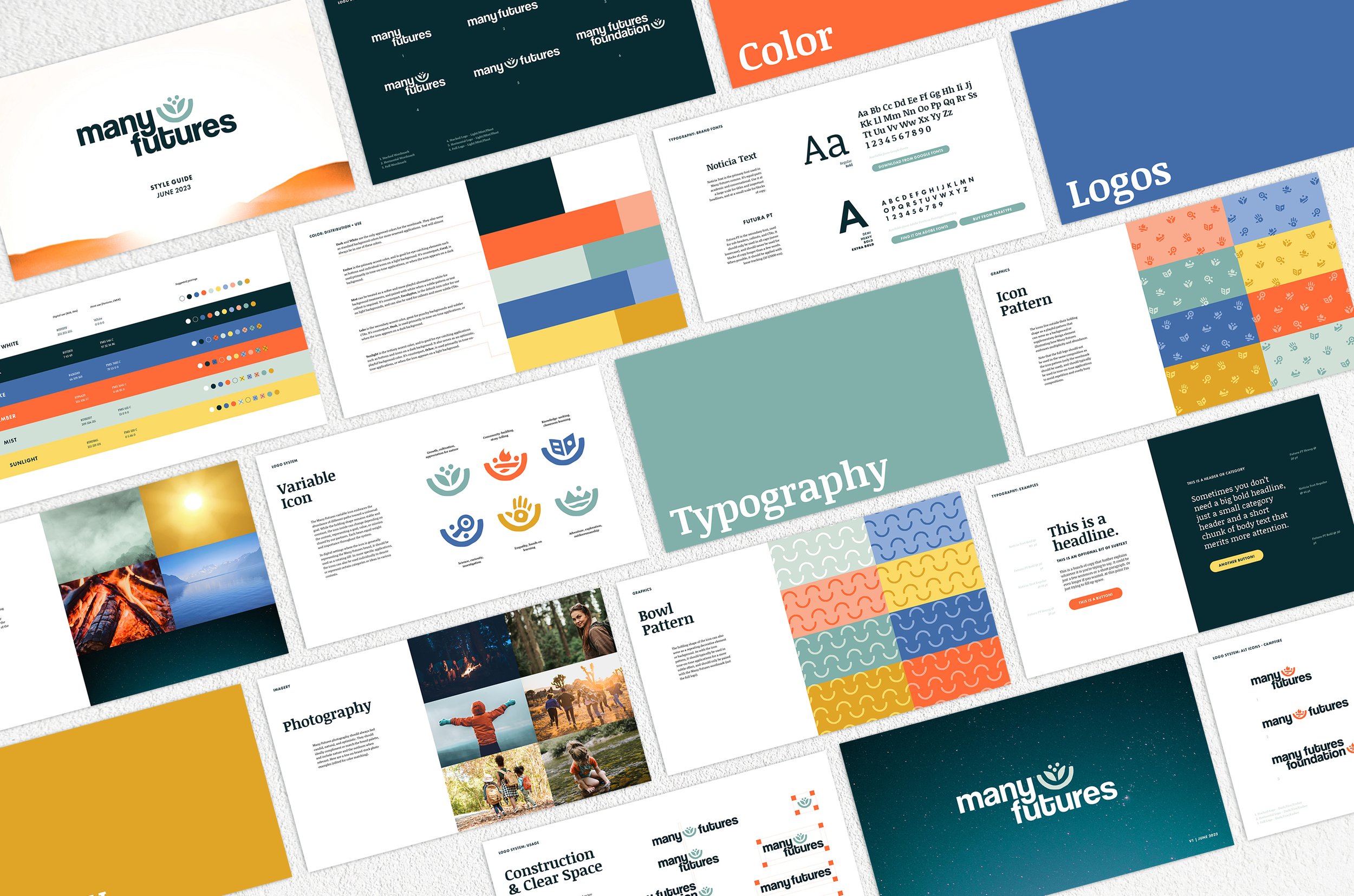
We landed on a direction that employs a vibrant, nature-inspired palette, candid people-focused photography, and a timeless typography system that feels at once academic and conversational. The addition of handmade graphical elements brings a human, grassroots edge to the brand, inspired by the imperfect, unabashed creativity of a child with a pile of construction paper.


The Many Futures wordmark was designed to balance timelessness with approachability, taking cues from the classic Helvetica while incorporating a few unconventional details that give it a playful contemporary twist. Stacked and kerned so that the letterforms align to cradle one another, the structure of the mark is a nod to the way that Many Futures aims to uplift and support its partners.
The brand’s variable icon embraces the abundance of different paths toward a universal goal— a supportive cradle that holds space for a wide array of missions. While the holding shape remains stable and constant, the icon inside changes depending on the context, representing a goal, value, or vision shared by the foundation’s partners. Additionally, we expanded the elements of the icon into playful supplemental patterns to bring depth and dynamism to applications and layouts.
“Danica brought clarity, precision, and creativity to the Many Futures naming and branding process, and was a pleasure to work with from the beginning. She made developing our organizational identity into something fun, and delivered a brand that I'm excited to look at and live in every day.”
-Meagan Scaringe, Founder
